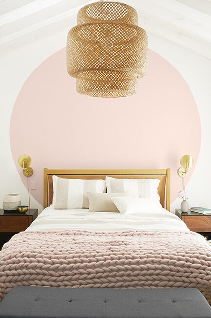
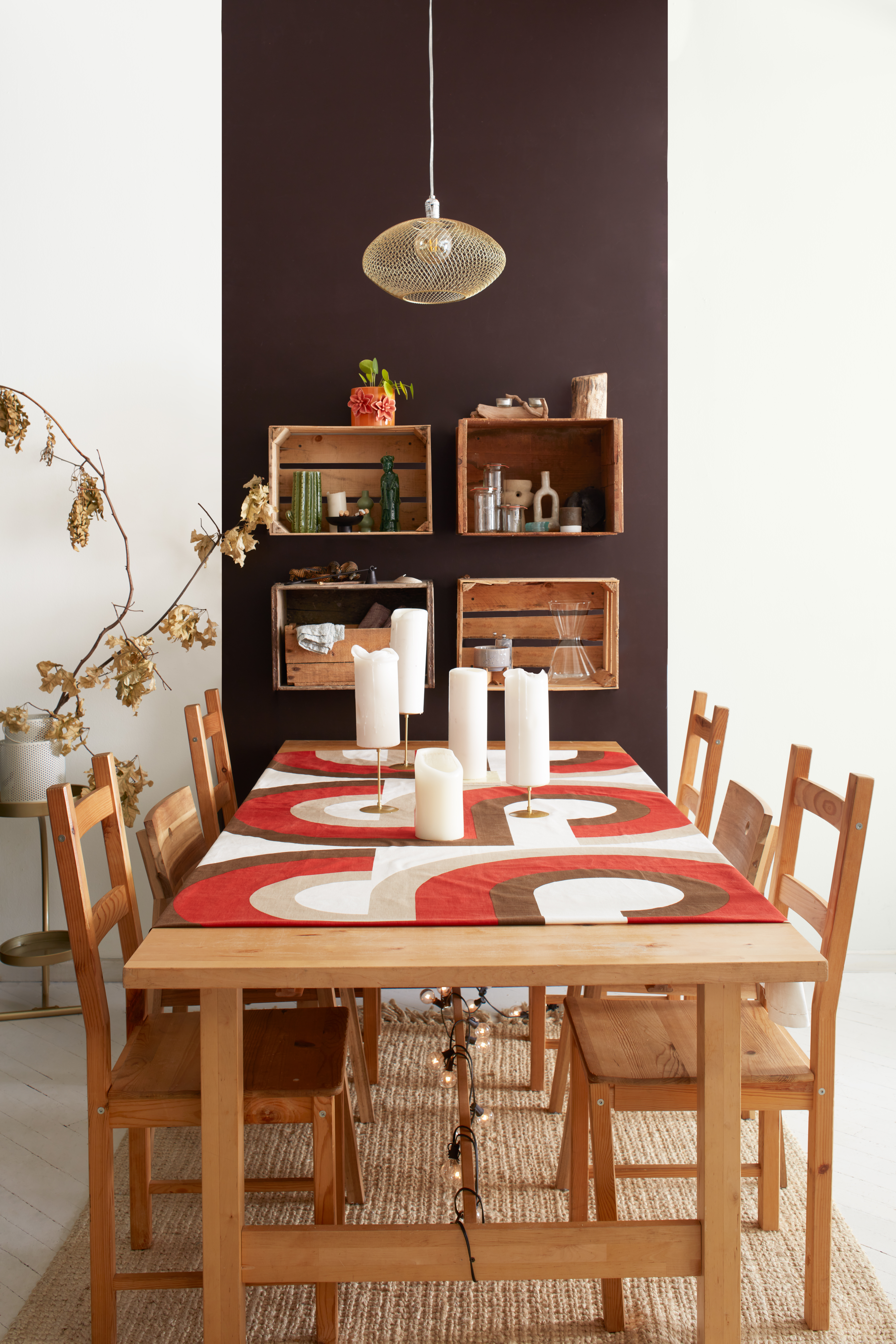
The color to structure the space!
Advices
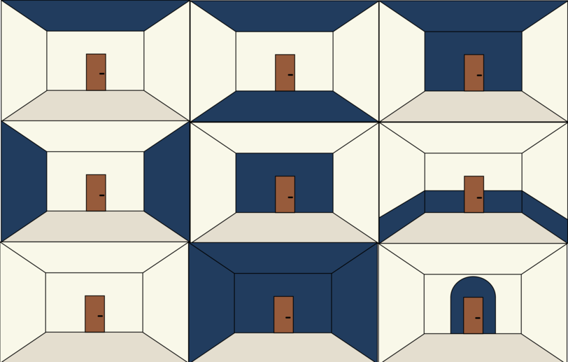
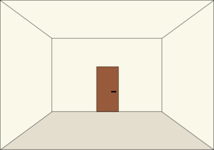
If the colors are used correctly, they can easily attenuate or even make disappear certain defects that a space can have.
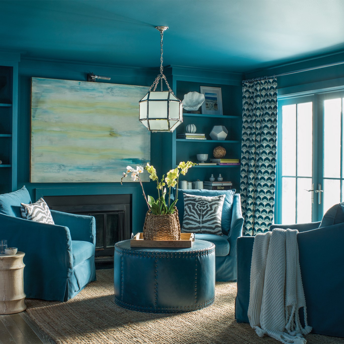
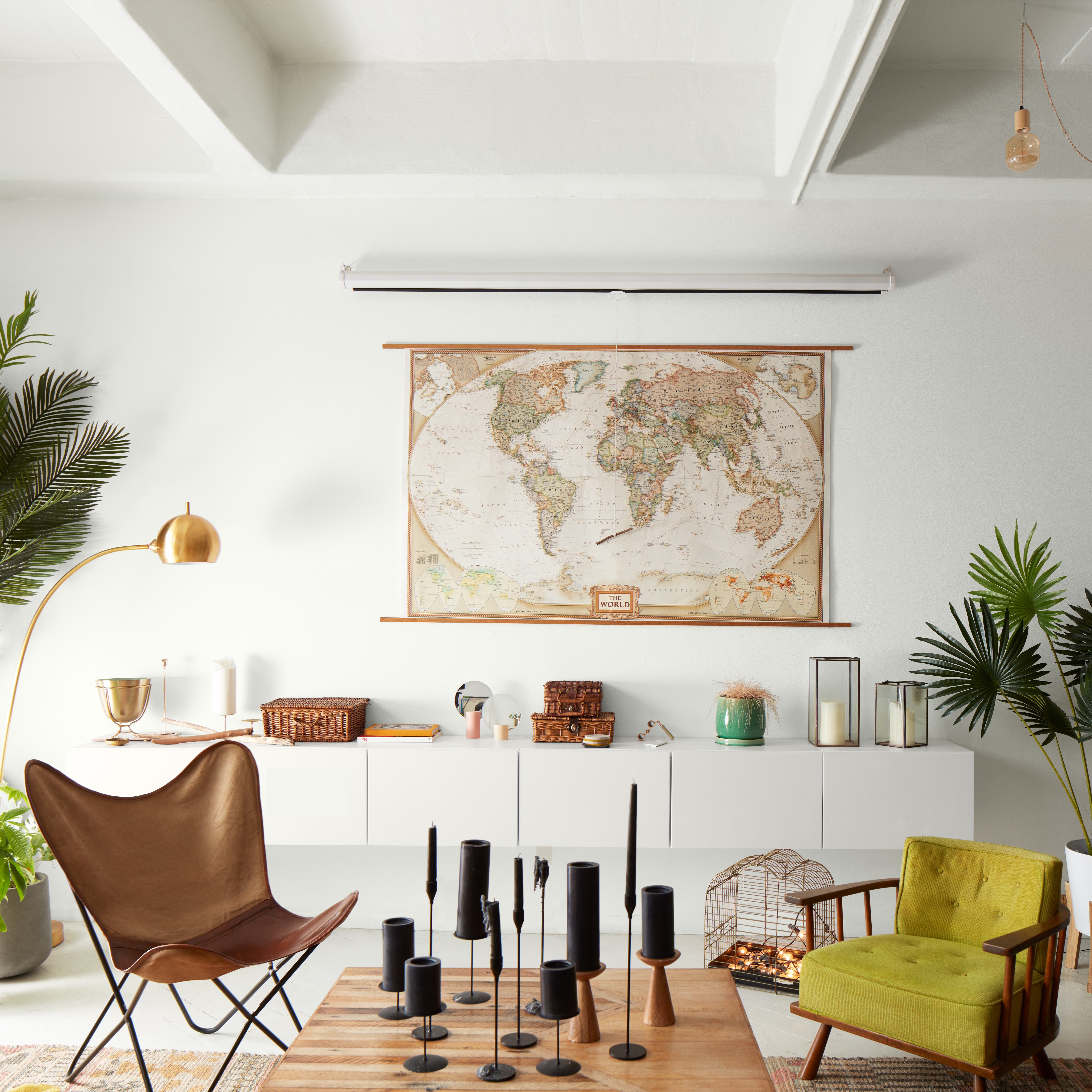
The dark colors will make a space more intimate, bring closer a ceiling too high or make a crossing room less elongated. As for the light colors, they will give the impression of pushing back the walls and expanding the space.
By correctly using each of these two categories, you can easily structure your interiors!
Some concrete examples:
● A clear interior for giving the impression to expand the space.
● A dark interior for a cozy, elegant atmosphere and cocooning effect.
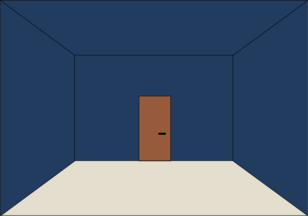
● Colour to delineate different spaces without partitioning.
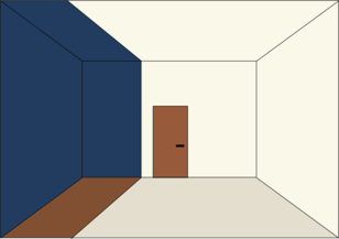
● Color to decrease the width of a space, the colored walls will seem closer to each other.
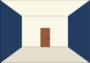
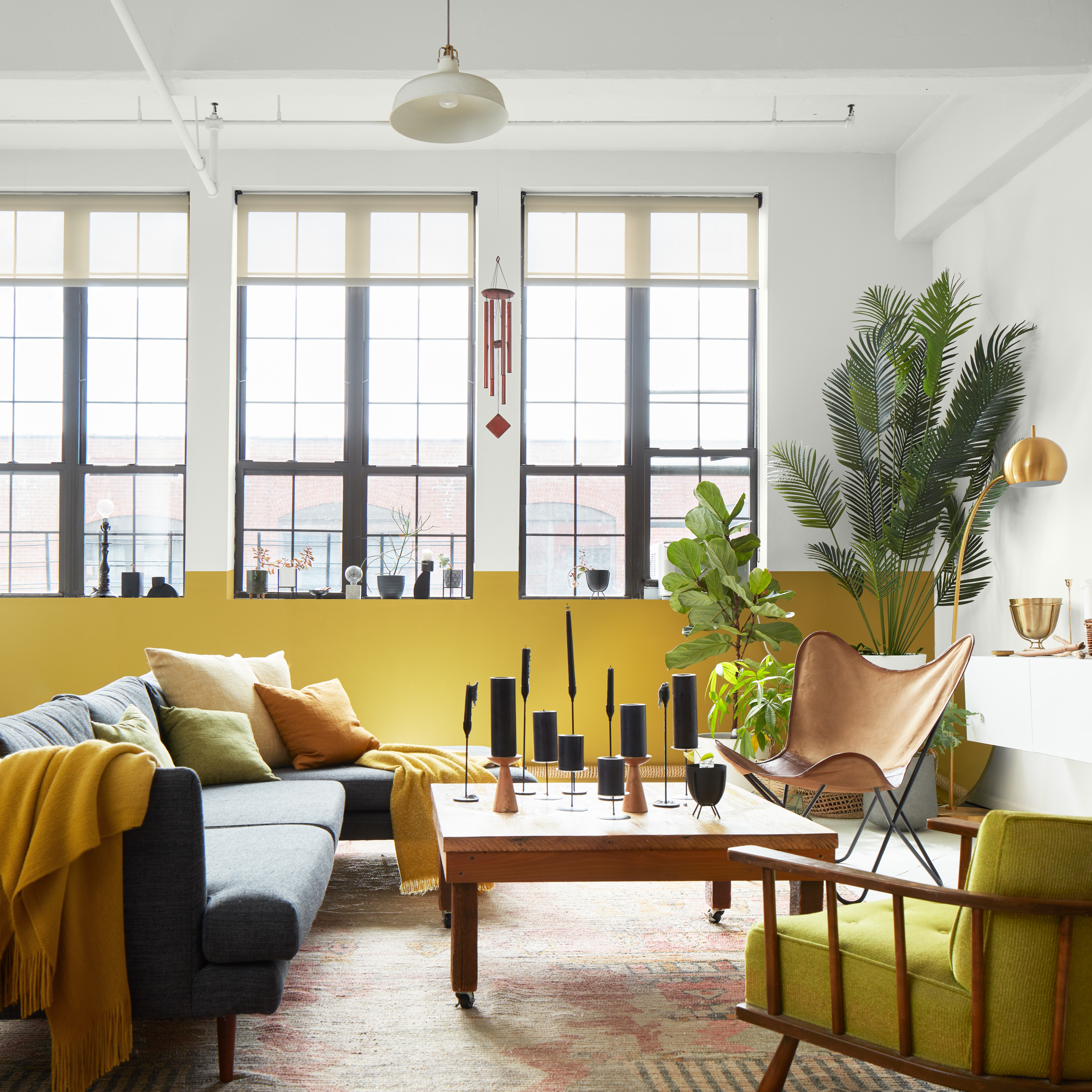
● A colored wall to give a touch of personality to a space.
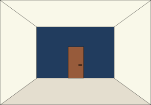
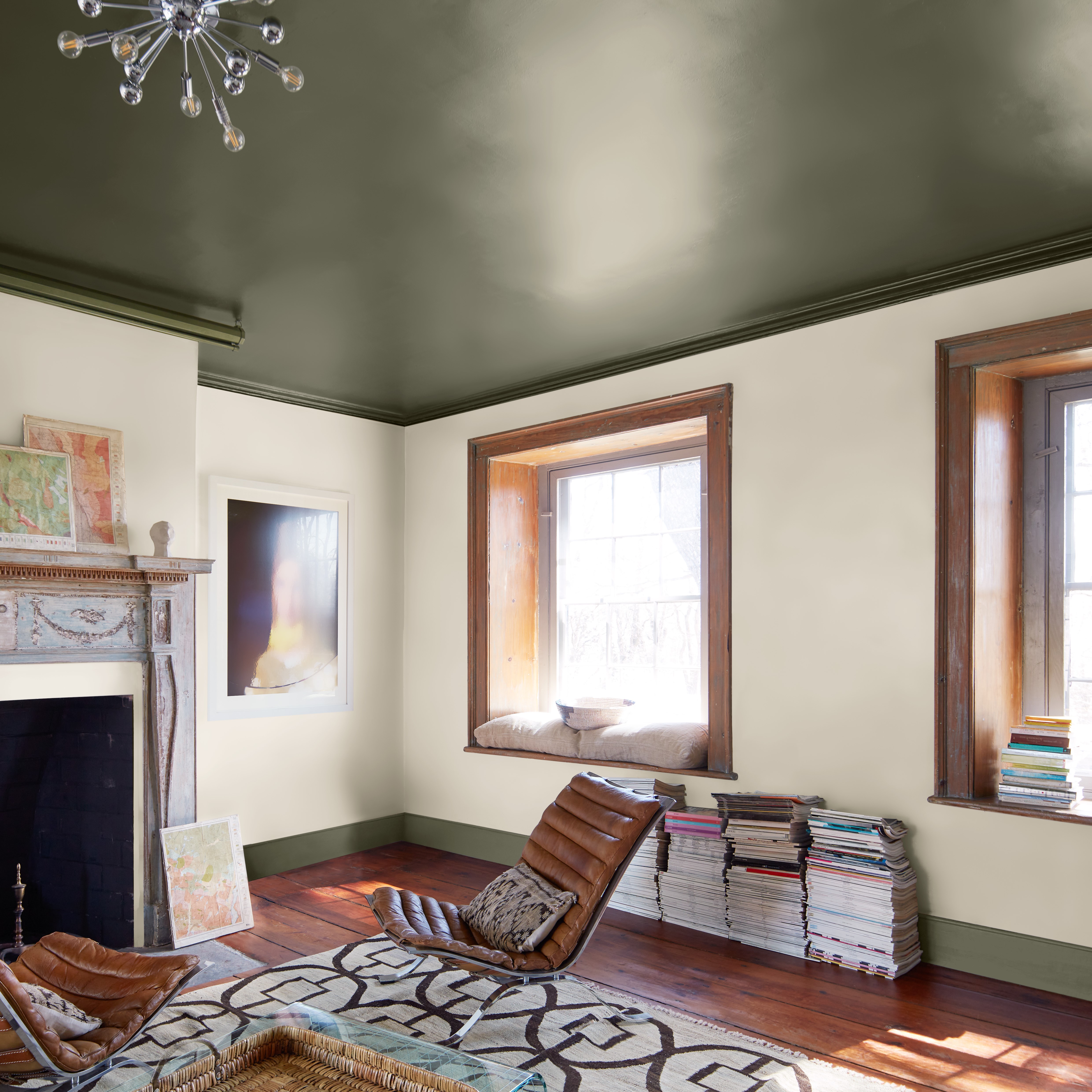
● Coloured ceiling and floor to reduce cathedral effect. Ideal when the hight of ceiling is important.
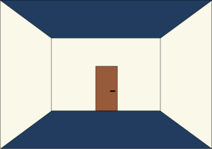
● A coloured ceiling and wall to reduce lengths. Ideal for endless corridors.
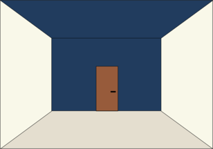
● A coloured trims, ideal for giving the impression of a higher ceiling.
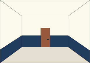
● Giving a shape to the color will highlight a decorative element.
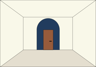
In conclusion, painting is a real indispensable in order to structure your interior. It should be noted that the more saturated the colour chosen, the greater the visual impact, the use of several shades with significant contrast can also accentuate the optical illusion.
To validate your choices before launching into a consequent order we will invite you o validate your choices before launching into a consequent order we will let’s test your colours with our Benjamin Moore© smart paint samples (236 ml)
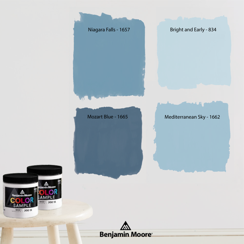
The entire Benjamin Moore - France team remains at your disposal to guide you in your future projects, do not hesitate to contact the showroom nearest you.
