How to associate colors?
Advices
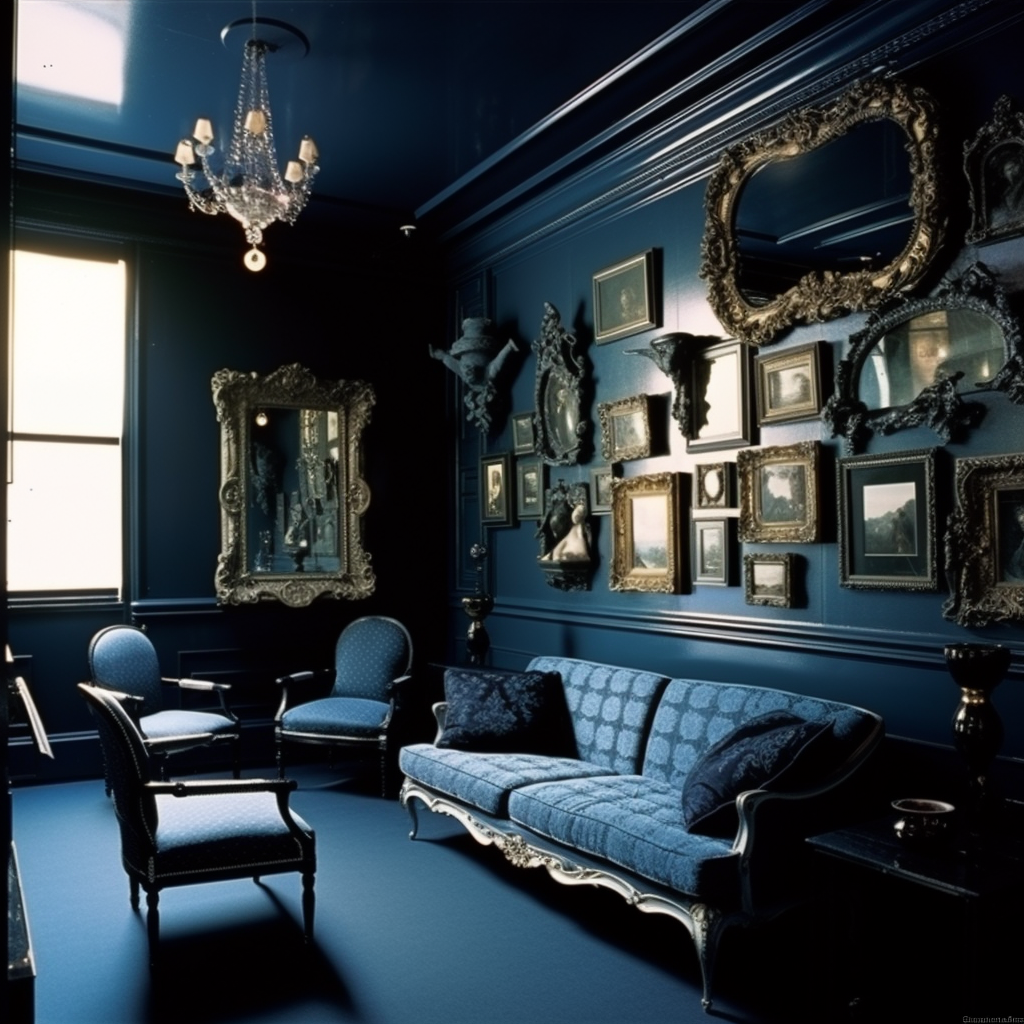
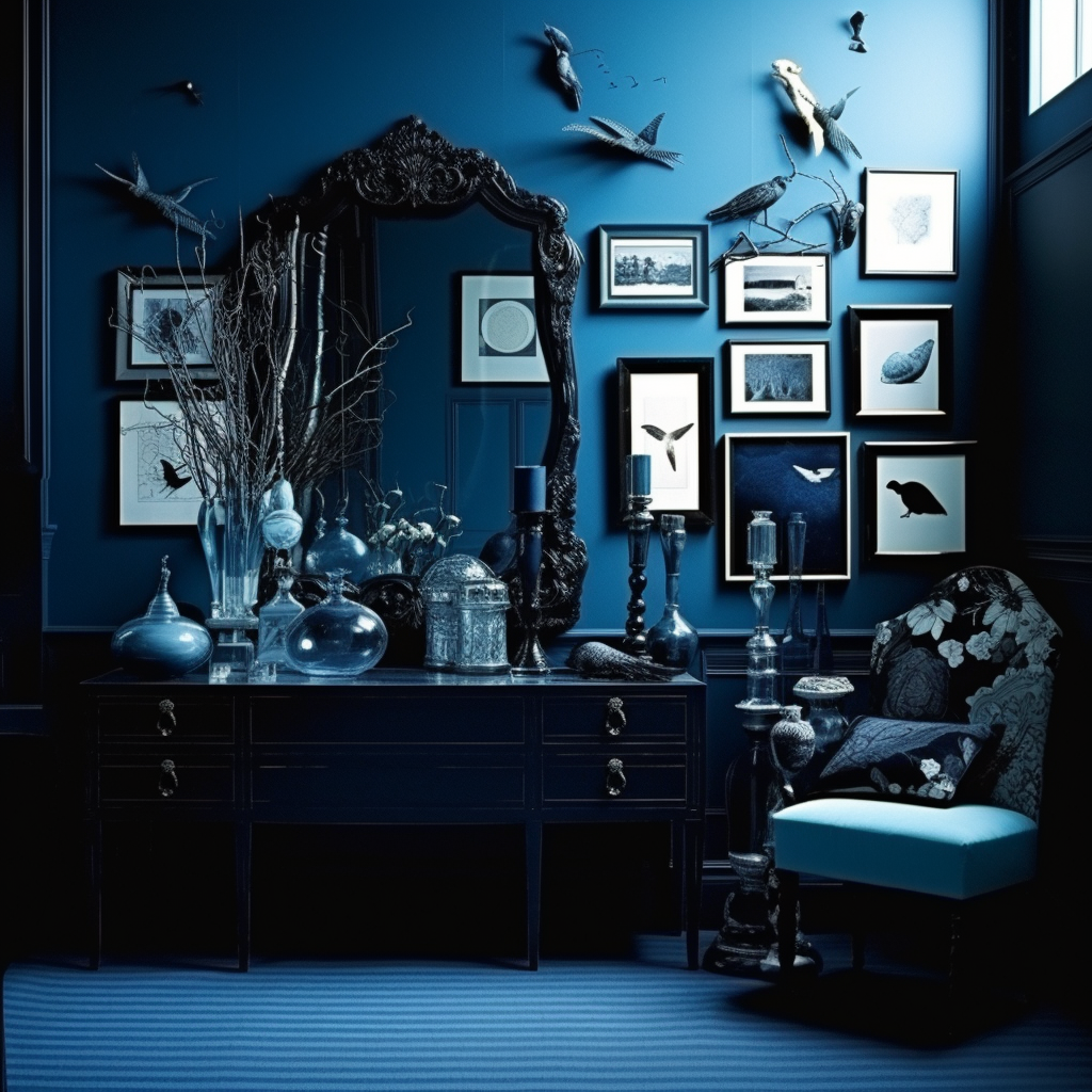
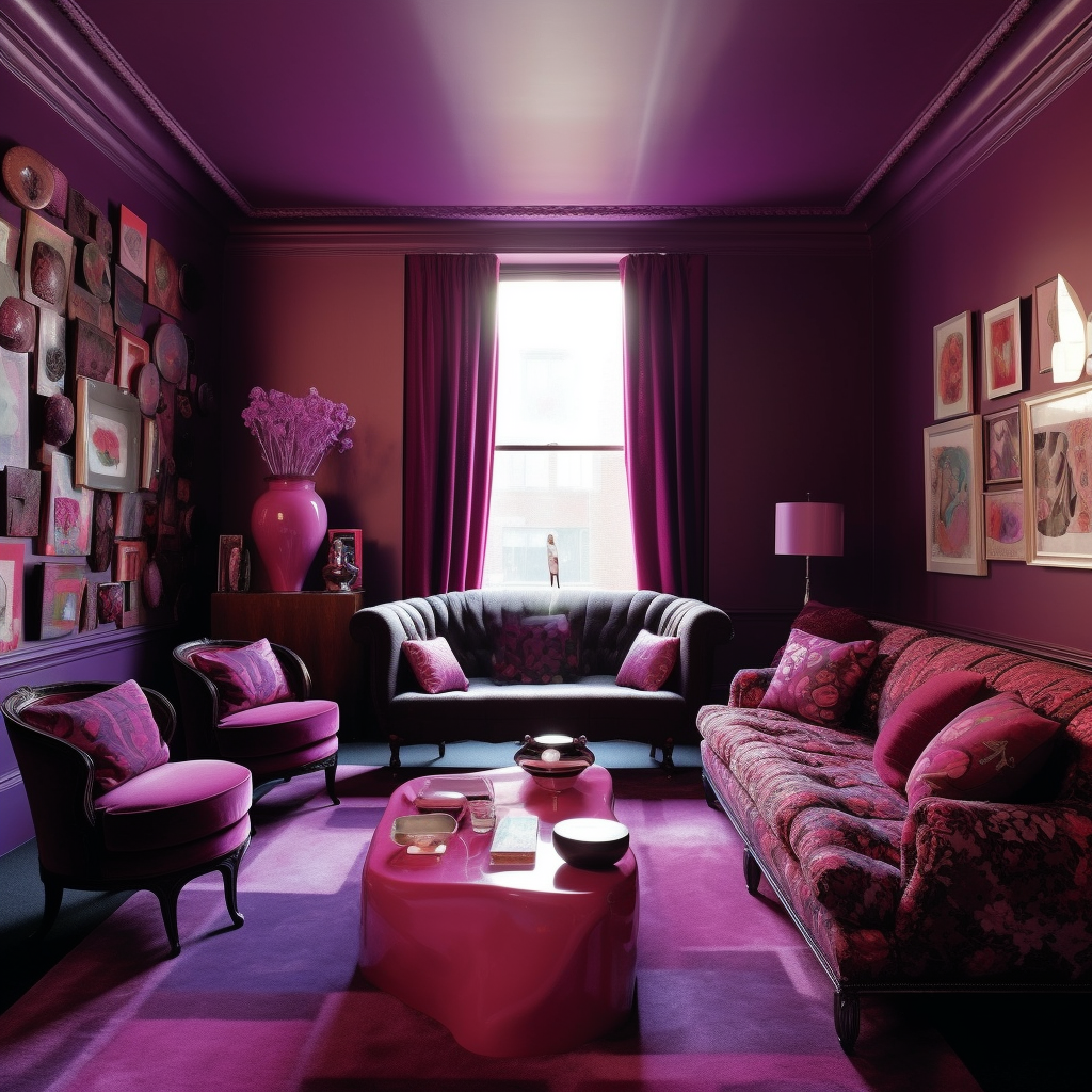
If your choice does not turn to the now well-known, Camaïeu. Which, as a reminder, consists of one or more graded shades of the same shade, it is important to choose colors that work well together to create a visually harmonious environment.

The chromatic circle is an excellent tool at your disposal to help you find colors that match well together. But before getting to the heart of the matter, what’s a chromatic circle:
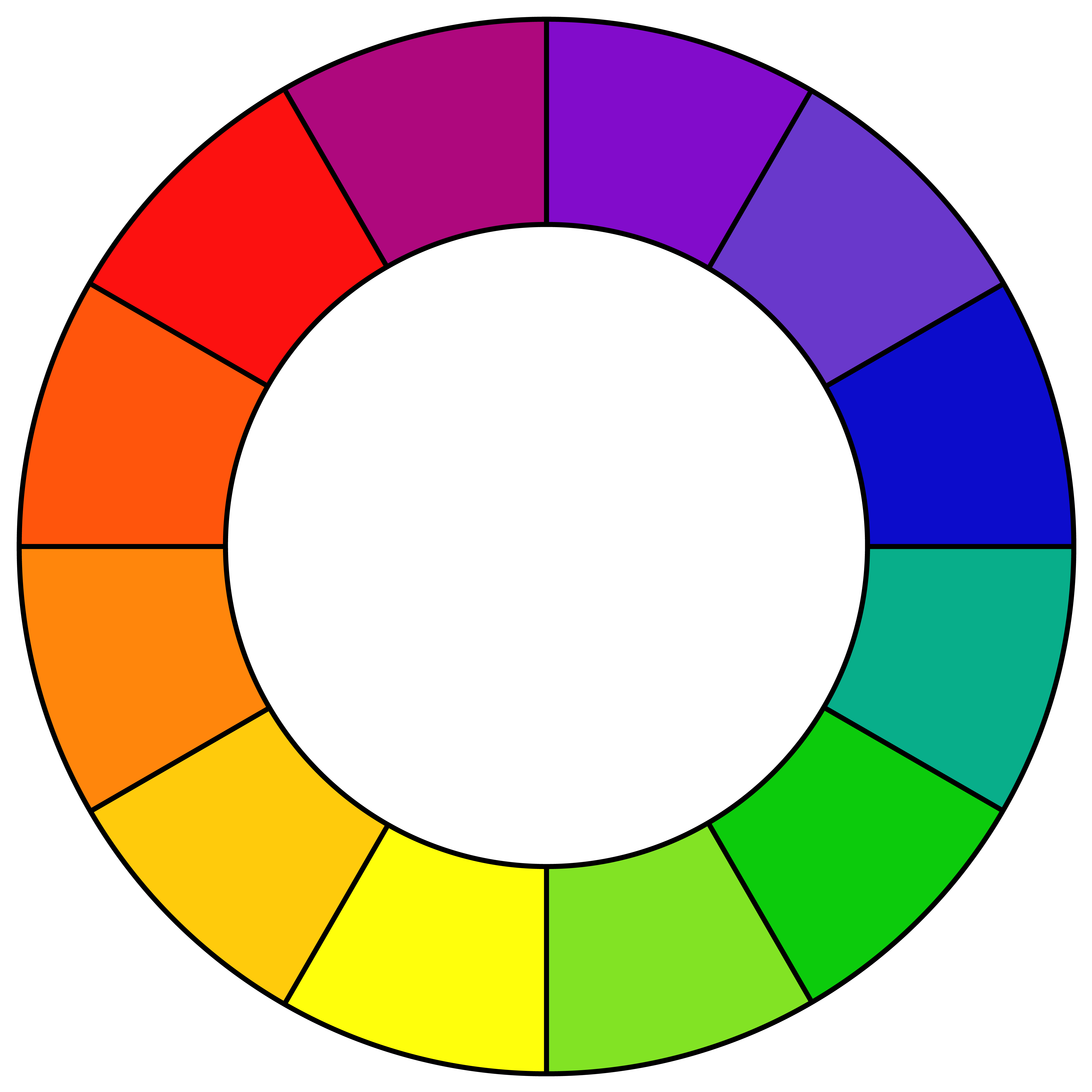 |
A chromatic circle is an ordered representation of colors, used in painting, dyeing, industrial design, fashion, graphic arts. The colors follow in the order of those of the rainbow, the closure being made by a transition from red to purple through purple.It allows to order the colors. It consists of three primary colours (red, yellow and blue), three secondary colours obtained from the primary colours (green, orange and violet) and six tertiary colours which are derived from the mixture of primary and secondary colours. |
This one by its design allows an optimal arrangement of the colors using the position of the colors on it to create your layouts:
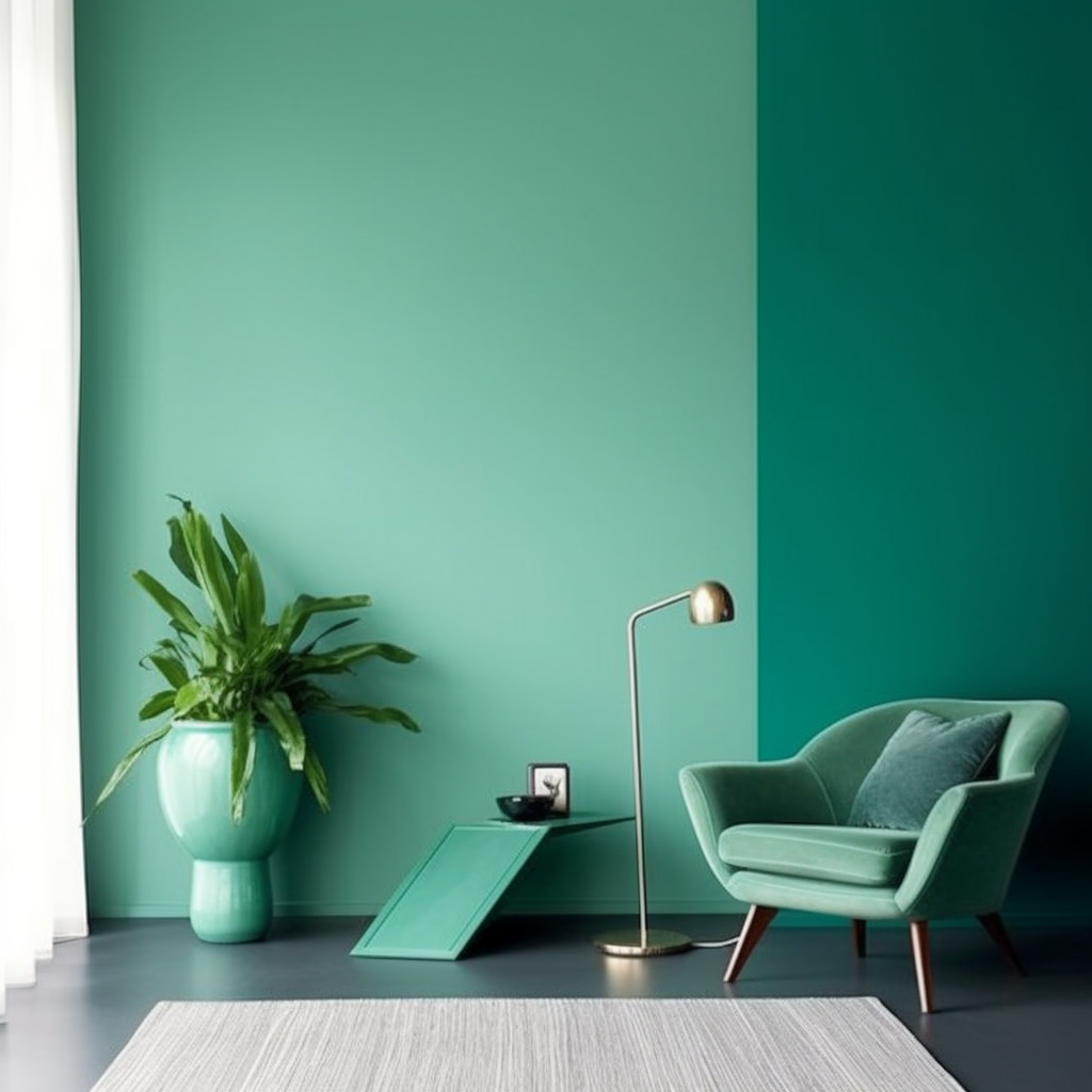
Analogous arrangements are sets of colours which are found side by side on the chromatic circle. They have similar hues and create a visually coherent whole. (Example: light green, dark green, turquoise)


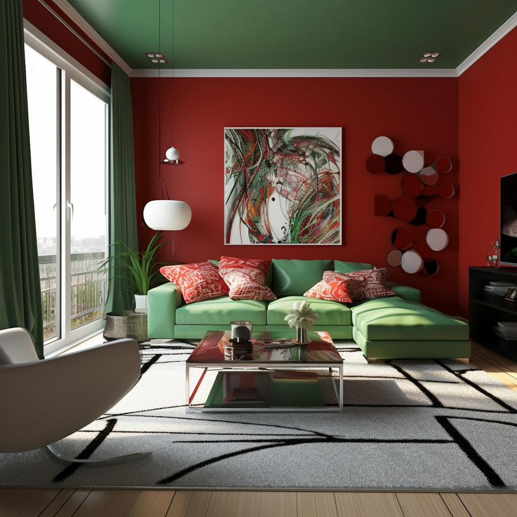
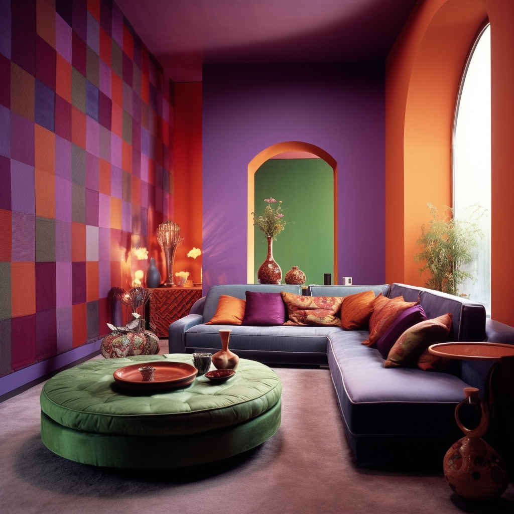
The complementary arrangements, on the other hand, are sets of opposite colors on the chromatic circle. They create a strong contrast and can thus be used to draw attention to a specific element. (Example: blue, orange)
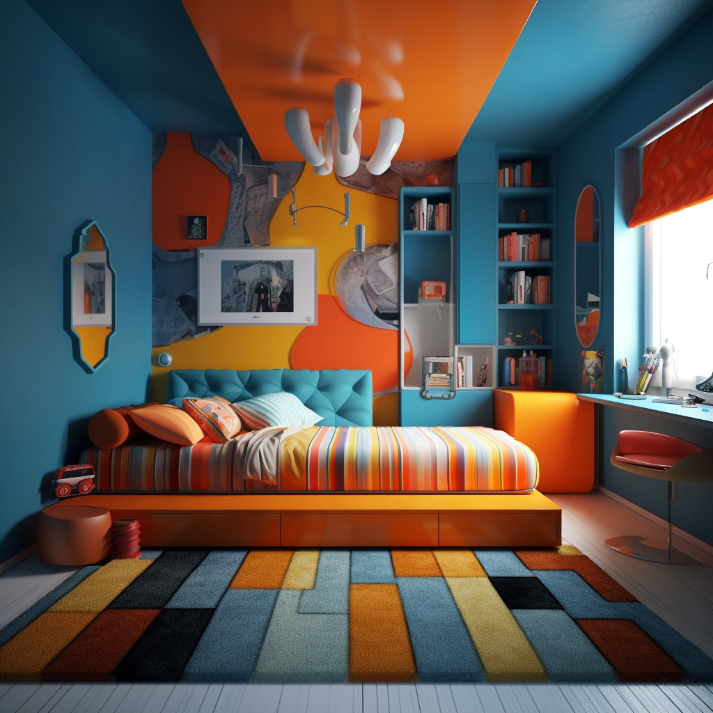


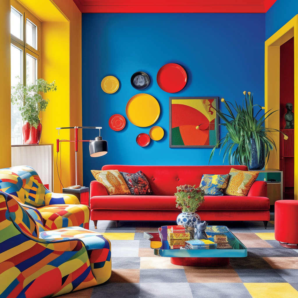
The triadic arrangements are sets of colors distributed in an equidistant triangle on the chromatic circle. They combine contrast and harmony for a result that does not leave indifferent. (Example: yellow, red, blue)


It is also from these various distributions that comes the legend of «No more than 3 colors in decoration» mentioned in one of our previous articles!
In reality, you don’t have to limit yourself to 3 colors although limiting yourself to 3 colors will greatly simplify the coherence of your project!

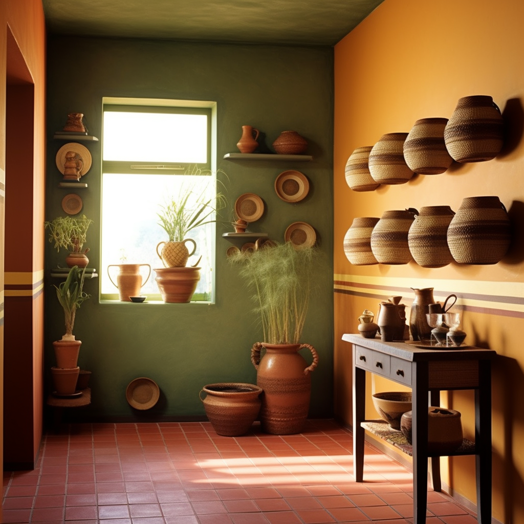
Choosing a “Theme” can also help frame your choice.
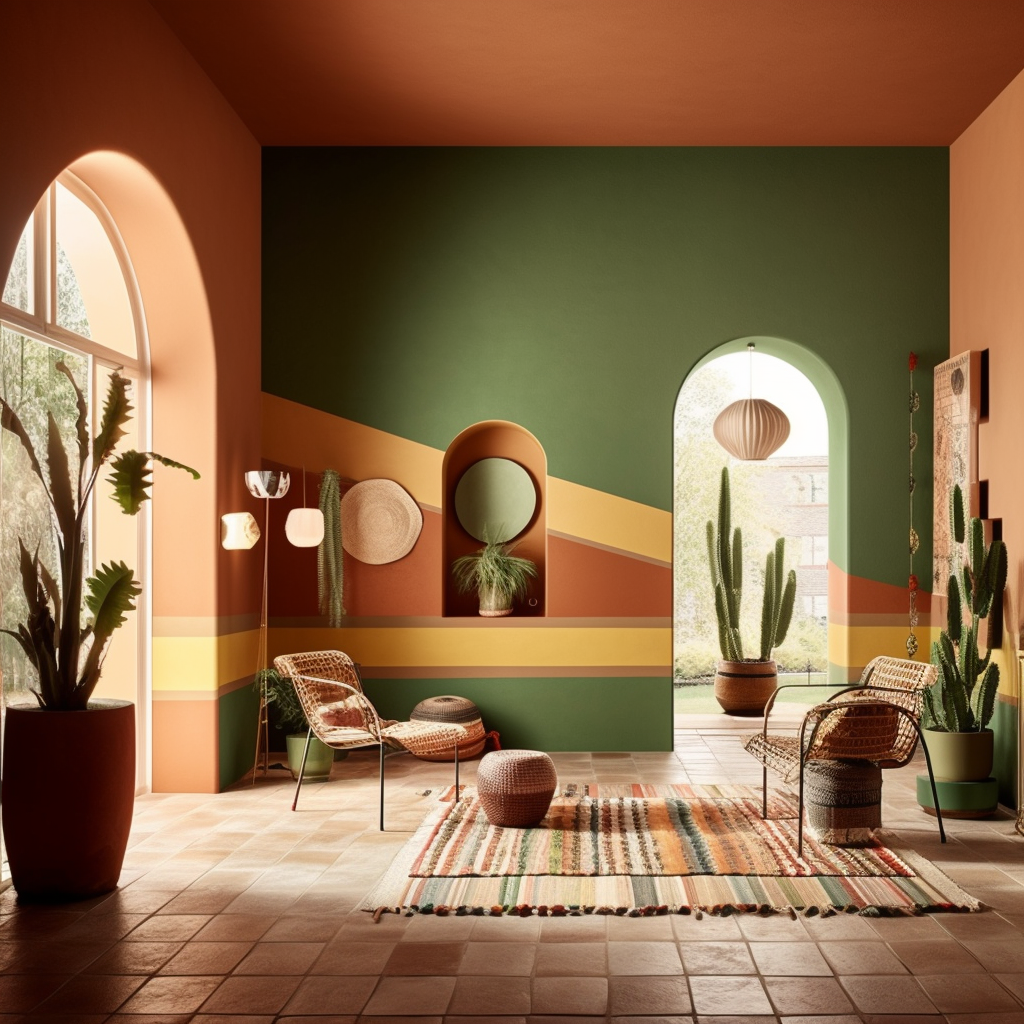
(Example: Natural tone => terracota, olive green, straw yellow, etc.)


In addition to choosing colors that work well together, it is important to know how to use them!
For example, they can help create a visual hierarchy by using brighter shades for the most important elements and softer shades for the elements to be set back.
You will also find today a large number of websites offering interesting color schemes and gradients that can help you find inspiration, the 3 best known are:
• Color Hunt
• Coolors
• Seeds
Or our various networks where a large number of achievements are published:
In summary even if we can glimpse generalities the choice of a color, this one is above all a question of taste and perception!
That’s why the entire Benjamin Moore - France team is at your disposal in our different showrooms to advise you and guide you in your choices and your projects!
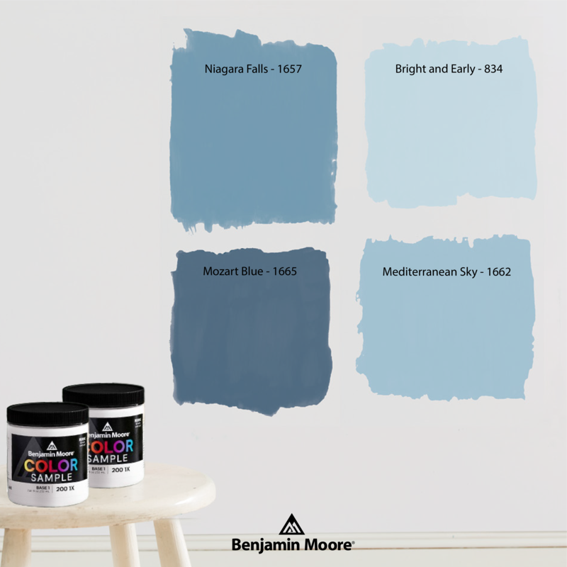
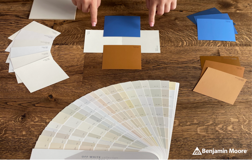
You will also find several tools at your disposal, such as our Color Portfolio application, which will allow you to project your colours on the walls and explore the 3,500 Benjamin Moore© colours, our colour fan decks, our smart paint samples (236 ml) to validate your choices before placing an order.
As well as our Affinity© collection and its 144 references, designed to match together every time!